

From Fundamentals to Modifiers
We’ve covered the core of the regime matrix, Growth and Inflation. Those two pillars give you the fundamental picture. Growth up, inflation down: Goldilocks. Growth down, inflation up: Stagflation. The combinations drive the playbook.
The fundamental picture alone doesn’t tell you enough. Two identical Growth x Inflation readings can produce completely different outcomes depending on what policy is doing. Growth positive and inflation stable sounds great until you realise policy is restrictive and tightening further. Then your “Goldilocks” is actually Late Cycle, and the clock is ticking.
Policy is the first of three modifier pillars (alongside Liquidity and Risk Appetite) that shape how the fundamental regime expresses across asset classes. If Growth and Inflation tell you what the economy is doing, Policy tells you what the authorities are doing about it. What the authorities do determines how long the current regime persists, how violently it transitions and which assets benefit or suffer along the way.
This is a tough pillar to get right, not because the data is hard to find, it’s actually the most transparent of all five pillars. Central banks publish their decisions, their projections, their minutes. Fiscal data is publicly available. The information is everywhere. The difficulty is knowing what to focus on, what to ignore, and how the different pieces interact.
Let me walk you through how I think about it now.
Why Policy Matters More Than You Think
I used to treat policy as background noise. The Fed cuts, the Fed hikes, markets react for a day and then fundamentals take over.
Policy doesn’t just respond to the economy. It shapes it and it shapes asset prices through channels that are far more powerful than the headline rate decision.
Think about it mechanically. When the Fed sets the overnight rate, it anchors the entire short end of the yield curve. That rate ripples into mortgages, corporate borrowing costs, auto loans, credit cards, every form of debt in the economy. When those costs change, so does behaviour. Businesses invest more or less. Consumers spend or save. Housing booms or busts. The transmission mechanism from a 25 basis point change in Fed Funds to actual economic activity is slow, messy, and uncertain but very real.
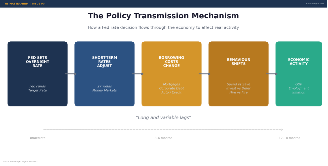
Then there’s the balance sheet. When the Fed buys Treasuries and MBS, it pushes investors out the risk curve. Yields compress, asset prices rise, financial conditions loosen. When it sells, or lets holdings roll off, the reverse happens. This is the plumbing that connects monetary policy to markets and it operates independently of the rate decision itself.
And fiscal policy, which most macro frameworks underweight or ignore entirely, puts money directly into the economy. Not through the banking system, not through credit channels, but directly: government spending, transfer payments, tax cuts. When the deficit widens, the government is adding demand. When it narrows, it’s withdrawing demand. This is arguably the most powerful short-term driver of growth and yet I see frameworks that track fourteen different Fed indicators and nothing on fiscal.
The reason I weight Policy at 20% of the regime composite (behind Growth at 30% and Inflation at 25% but ahead of Liquidity and Risk Appetite) is that it’s the bridge between fundamentals and market outcomes. It tells you whether the authorities are reinforcing the current trend or fighting it. And that distinction is the difference between a regime that persists and one that’s about to flip.
The Three-Layer Model
Just as the inflation pillar uses a pipeline (upstream, midstream, downstream), the policy pillar works in layers. Each one captures a different mechanism through which policy affects the economy and markets. Get comfortable with this structure, because it’s the architecture that makes everything else work.
Layer 1: Monetary Policy. The Fed’s rate decisions, forward guidance and balance sheet operations. This is what everyone watches, what CNBC covers on FOMC day, what moves markets in the short term. It matters, but it’s not the whole story.
Layer 2: Fiscal Policy. Government spending, taxation and the resulting deficit or surplus. This is the layer most macro analysts underweight. It’s harder to track in real-time, harder to quantify and harder to forecast. But its impact on growth is often larger and more direct than anything the Fed does.
Layer 3: Financial Conditions. The aggregate result of both monetary and fiscal policy, filtered through markets. Are conditions loose or tight? Is credit flowing or constrained? Are asset prices inflated or depressed? Financial conditions indices capture the net effect of everything the authorities are doing and everything the market is doing in response.
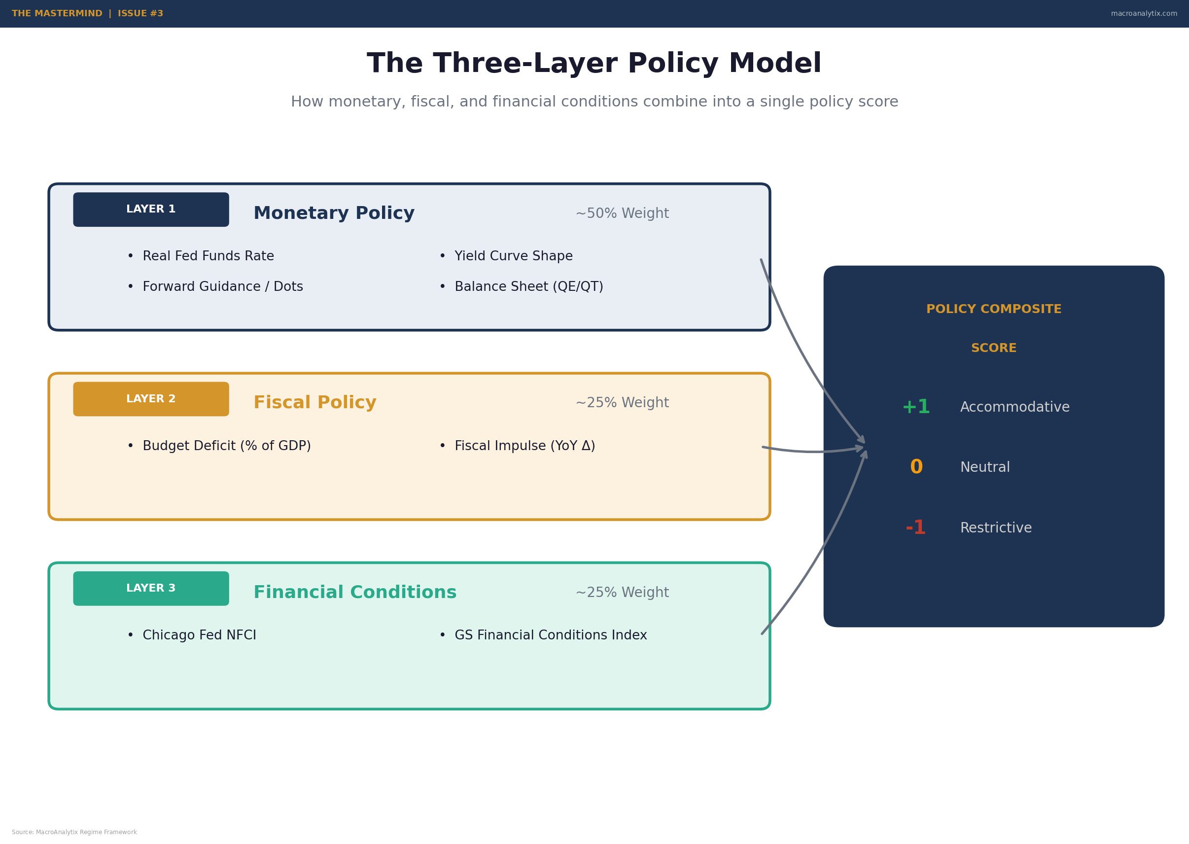
The power of this model is in the combinations. Monetary loose and fiscal tight is a completely different animal from monetary tight and fiscal loose. Each combination has distinct implications for growth, inflation, and asset prices. I’ll walk you through the specifics, but first let me explain each layer in detail.
Layer 1: Monetary Policy - Beyond the Headline Rate
Every six weeks, the Fed announces a rate decision. Markets move. Pundits opine and then the next day, everyone goes back to watching the same indicators they were watching before. The actual analysis of monetary policy gets lost in the noise of the event.
Here’s what I’ve learned to focus on instead.
Real Rates, Not Nominal Rates.
This is probably the single most important concept in the entire policy pillar, and it’s the one most retail investors miss completely.
The nominal Fed Funds rate (the number you see on the news) tells you almost nothing by itself. A rate of 4% is restrictive when inflation is 2% (real rate = +2%). The same 4% is accommodative when inflation is 5% (real rate = -1%). The economy doesn’t care what the nominal rate is. It cares what the rate is relative to inflation.
Real Fed Funds = Nominal Fed Funds minus Core PCE. That’s it. Simple arithmetic, but the implications are profound.
When real rates are deeply negative, say below -1%, the Fed is effectively paying people to borrow. Money is free in real terms. That’s aggressively accommodative. When real rates are significantly positive, above +1%, the Fed is making borrowing genuinely expensive. That’s restrictive. Between those thresholds, policy is roughly neutral.
The scoring in my framework reflects this directly. Real Fed Funds below -1% scores as accommodative (+1). Around zero scores as neutral (0). Above +1% with a shrinking balance sheet scores as restrictive (-1). The level matters, but the direction matters just as much, real rates falling from +2% to +1% is still restrictive, but the trajectory is easing.
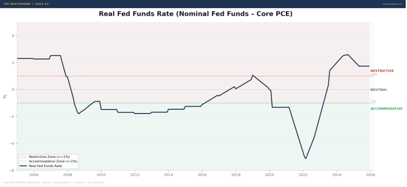
Source: FRED FEDFUNDS, FRED PCEPILFE | Real Rate = Fed Funds Effective − Core PCE YoY
I used to just track the nominal rate and the dot plot. That cost me money in 2022 when the Fed was hiking aggressively but real rates were still negative because inflation was running above the funds rate. Everyone was screaming about “tight policy” but real rates told a completely different story. Policy wasn’t actually restrictive until well into the hiking cycle. If you were positioned for “tight money” too early, you got run over.
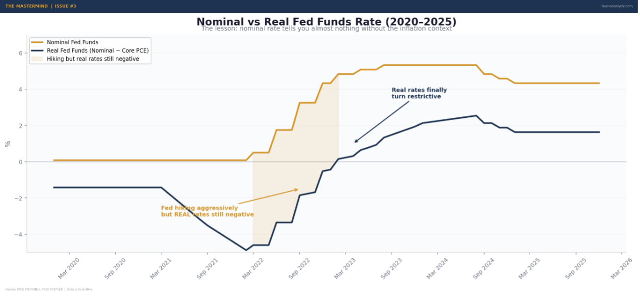
Source: FRED FEDFUNDS, FRED PCEPILFE
The Yield Curve as a Policy Signal
The yield curve is probably the most over-discussed, under-understood signal in all of macro. Everyone knows an inverted curve “predicts recession.” Few understand why it works or, more importantly, when it stops working.
The basic logic is sound. The curve shape reflects the market’s expectation for future short-term rates. When the curve is steep, long-term rates much higher than short-term, the market expects rates to rise, which usually means growth and inflation are expected to pick up. When the curve inverts, short rates above long rates, the market expects the Fed will need to cut, which usually means a downturn is coming.
The specific spread I watch most closely is the 10-year minus 3-month. It has the cleanest historical track record as a recession signal. The 2s10s gets more attention, but the 10Y-3M is more mechanically tied to Fed policy, the 3-month rate is essentially the Fed Funds rate with a small premium, so the spread captures the gap between where the Fed is and where the market thinks the economy is headed.
But here’s the nuance that most people miss: the inversion itself isn’t the recession signal. The un-inversion is. Historically, recessions don’t begin when the curve inverts, they begin when the curve steepens after a prolonged inversion. That’s when the market starts pricing in emergency cuts. That’s when the data actually breaks.
We saw this play out in late 2024 and early 2025. The 10Y-3M had been inverted for months. Then it steepened aggressively as the Fed started cutting. The curve going from -50 basis points to +50 wasn’t an “all clear” it was the market saying “the Fed is going to have to ease a lot more than you think.” That’s a very different signal, and getting it right matters for positioning.
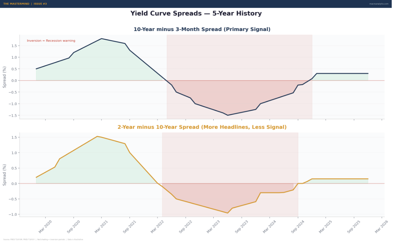
Source: FRED T10Y3M, FRED T10Y2Y | Red shading = inversion periods
I weight the curve as a confirmation tool, not a leading signal. It tells me whether the bond market agrees with my fundamental assessment. If I’m reading growth as positive but the curve is deeply inverted, one of us is wrong and the bond market has a better track record than I do.
Forward Guidance and the Dot Plot
This is the part of monetary policy that’s changed the most over the past two decades. The Fed now communicates extensively about future intentions, through the dot plot, the Summary of Economic Projections, press conferences, and individual governor speeches. This forward guidance is arguably more important than the rate decision itself, because markets are forward-looking.
The dot plot tells you what each FOMC member expects the funds rate to be at year-end over the next few years. The median dot gets the headline. But the dispersion matters more than the median. When dots are tightly clustered, there’s consensus, the Fed is confident in its path. When dots are widely spread, there’s disagreement and disagreement means uncertainty about the reaction function.
I watch the gap between market pricing and Fed guidance closely. When futures are pricing significantly more cuts than the dots suggest, the market is betting the Fed will be forced to ease by deteriorating data. When futures are pricing fewer cuts, the market thinks the Fed is too dovish. This gap is a tension that resolves one way or another and the resolution drives rates volatility.
The December 2025 FOMC was a perfect example. The dot plot showed only one cut for 2026. The market had been pricing three to four. That gap, between what the Fed said and what the market believed, drove an 87 basis point swing in the 2s10s spread over a matter of weeks. If you were paying attention to the guidance mismatch, you were prepared. If you were just watching the headline rate, you were blindsided.
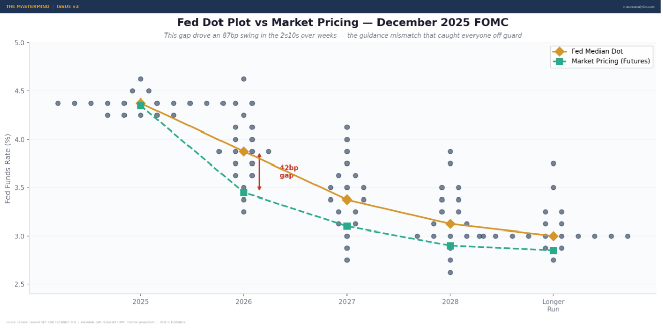
Source: Federal Reserve SEP, CME FedWatch Tool
Balance Sheet Operations
The rate is the price of money. The balance sheet is the quantity. Both matter.
When the Fed buys bonds (QE), it increases the supply of reserves in the banking system. Banks have more cash, lending conditions ease, asset prices tend to rise. When the Fed shrinks its holdings (QT), either by selling or letting bonds mature without reinvestment, reserves drain, conditions tighten, and the risk premium on financial assets tends to increase.
I track the balance sheet as a year-over-year change. Expanding balance sheet = accommodative. Shrinking = restrictive. The pace matters too. A gradual runoff is very different from active selling. The Fed learned this the hard way in 2018-19 when “autopilot” QT nearly triggered a funding crisis.
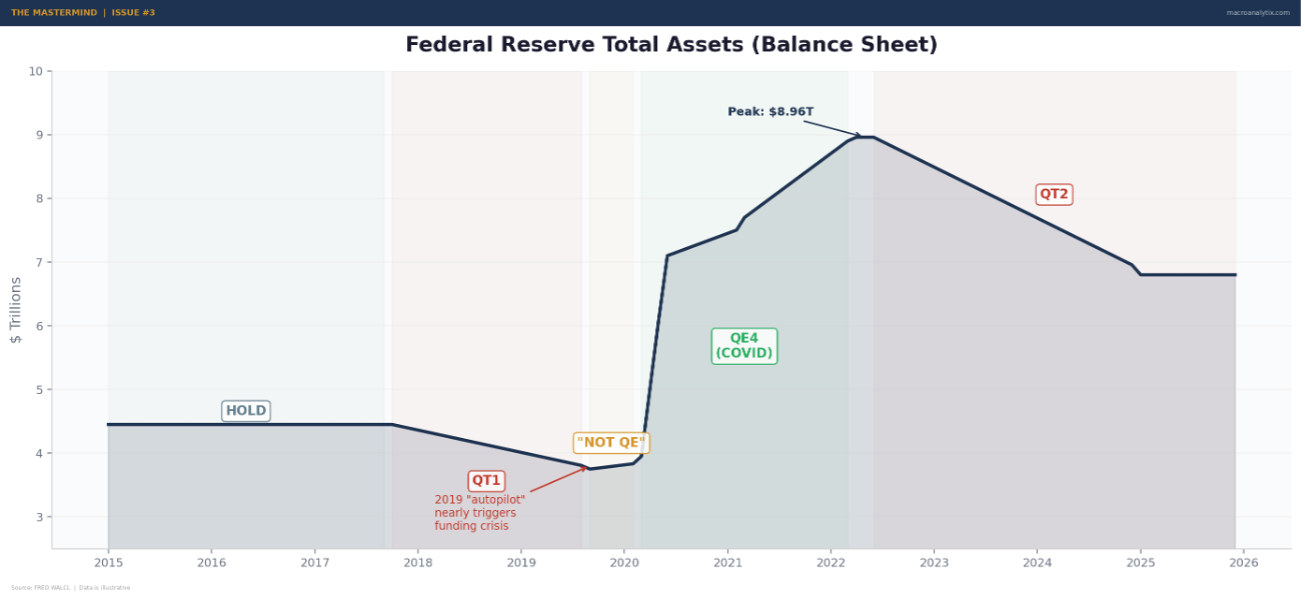
Source: FRED WALCL
For the regime framework, the balance sheet is a binary overlay. If the balance sheet is expanding year-over-year, that’s a positive signal regardless of the rate level, the Fed is actively adding liquidity. If it’s contracting, that’s a drag even if rates are low. The combination of rate stance and balance sheet direction gives you the full picture of what the Fed is actually doing, not just what it’s saying.
Layer 2: Fiscal Policy — The Elephant Nobody Watches
This is the layer I was slowest to incorporate into the framework. For years, I basically ignored fiscal policy. The Fed was the show. Fiscal was something economists argued about and politicians used as a talking point. It didn’t seem tradeable.
I was completely wrong. And the 2020-2023 period proved it.
When the US government ran 15%+ of GDP in deficit spending during COVID, it didn’t matter what the Fed was doing with rates. The fiscal fire hose overwhelmed everything. Growth surged. Inflation surged. Asset prices surged. The monetary policy signal was noise compared to the fiscal signal.
That was an extreme case, but the principle holds in normal times too. A budget deficit of 6% of GDP, which is roughly where we’ve been recently, is meaningful demand injection even when rates are at 5%. The government is still adding to spending, still employing people, still transferring money to households. That has a direct and immediate effect on growth that monetary policy can only influence indirectly through credit channels.
The Deficit Level vs The Fiscal Impulse
This distinction is to fiscal policy what the “level vs direction” lesson was to growth indicators. The deficit level tells you the current stance, how much the government is spending relative to what it takes in. The fiscal impulse tells you whether that stance is getting more or less stimulative.
The fiscal impulse is the year-over-year change in the deficit. A deficit that widens from 4% to 6% of GDP is stimulative, the government is adding more demand than last year. A deficit that narrows from 6% to 4% is contractionary, even though the government is still running a deficit, it’s adding less demand than before. The economy feels the change, not the level.
This is counterintuitive and trips up a lot of people. A 5% deficit sounds stimulative and in absolute terms, it is. But if last year the deficit was 7%, the economy is experiencing a 2-point fiscal drag. That drag matters for growth in exactly the same way that a rate hike matters, it’s removing stimulus that was previously supporting activity.
I track both. The deficit level tells me the structural stance. The fiscal impulse tells me the direction. When both are positive and rising, fiscal policy is a strong tailwind. When the deficit is large but narrowing, fiscal is shifting from tailwind to headwind regardless of the absolute number.
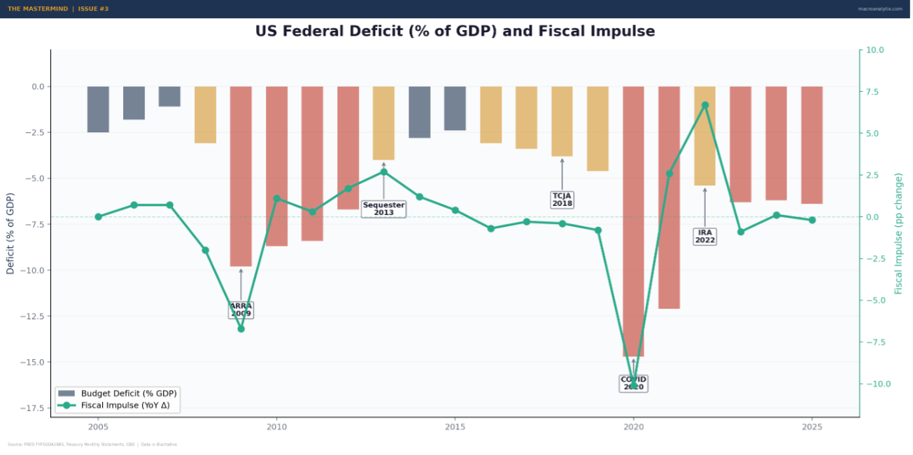
Source: FRED FYFSGDA188S, Treasury Monthly Statements, CBO
Why Most Frameworks Get Fiscal Wrong
Three reasons I see people consistently misread fiscal policy:
First, they confuse the political debate with the economic reality. Whether the deficit is “too big” is a political question. Whether the deficit is adding to or subtracting from demand is an economic question. I don’t care about the former for regime classification. I only care about the latter.
Second, they treat fiscal as slow-moving and therefore ignorable. It’s true that fiscal policy changes less frequently than monetary policy, there’s no fiscal FOMC meeting every six weeks. But when it does change, the impact is often larger and more direct. The fiscal cliff, sequestration, COVID stimulus, the IRA, these were all regime-level events that moved markets for months or years.
Third, they underweight the interaction between fiscal and monetary policy. This is where the Policy Mix Matrix comes in, and I’ll cover it in detail shortly. But the short version is: the same fiscal stance means very different things depending on what the Fed is doing, and vice versa.
Layer 3: Financial Conditions - The Net Effect
Financial conditions indices attempt to answer a simple question: taking everything into account, rates, credit spreads, equity prices, the dollar, volatility, how easy or hard is it for the economy to access money?
This is the layer where monetary and fiscal policy meet market reality. The Fed can cut rates, but if credit spreads widen simultaneously, conditions might actually tighten. The government can run a deficit, but if it crowds out private borrowing by pushing yields higher, the net effect could be neutral or negative.
I watch two main indices:
The Chicago Fed National Financial Conditions Index (NFCI) is the workhorse. It’s comprehensive, covering risk, credit, and leverage subcomponents. Zero means average conditions. Negative readings mean conditions are looser than average. Positive means tighter. It’s the one I weight most heavily because it captures the broadest range of inputs and has a good track record relating to economic outcomes.
The Goldman Sachs Financial Conditions Index (GS FCI) gets more attention in markets. It weights equity prices more heavily, so it tends to be more responsive to stock market moves. That’s both a feature and a bug—it captures sentiment shifts quickly, but it can overreact to equity corrections that don’t affect the real economy.
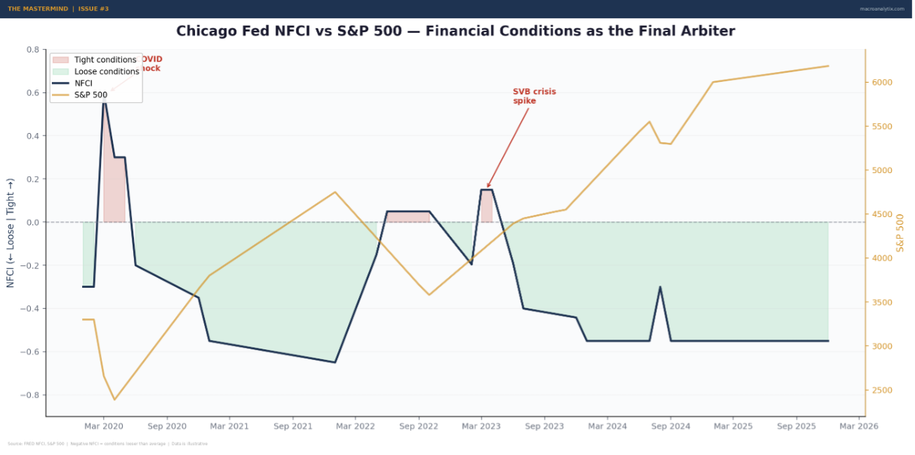
Source: FRED NFCI, S&P 500 | Negative NFCI = conditions looser than average
The key insight with financial conditions is that they’re the final arbiter of whether policy is actually working. The Fed can intend to tighten, but if markets front-run rate cuts and loosen conditions prematurely, the tightening doesn’t reach the real economy. Conversely, the Fed can cut rates, but if a credit event causes spreads to blow out, conditions tighten despite the cuts. Financial conditions capture what’s actually happening, not what policymakers want to happen.
A personal example: in early 2025, the Fed was on hold and QT was winding down. By any textbook measure, policy was restrictive. But financial conditions were loose, equity prices were elevated, credit spreads were tight, the dollar was stable. The economy was behaving as if policy was accommodative because markets had already done the easing. Watching only the Fed would have given you the wrong read. Watching financial conditions told the actual story.
The Policy Mix Matrix
This is the framework within the framework. It’s probably the single most valuable tool in the entire policy pillar, and I wish someone had explained it to me earlier in my career.
The idea is simple: plot the monetary stance against the fiscal stance as a 2×2 matrix. Four quadrants, four very different market environments.
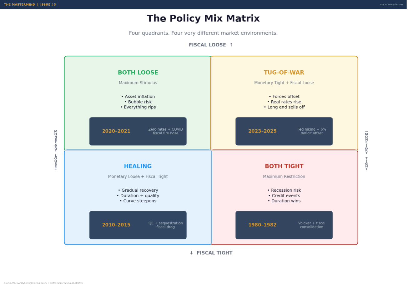
Source: MacroAnalytix Regime Framework
Quadrant 1: Monetary Loose + Fiscal Loose. Maximum stimulus. This is the “money everywhere” environment. Growth gets a boost from both channels. Asset prices inflate. Risk appetite surges. The danger is bubbles and overheating. When both levers are pulling in the same direction, the economy can overshoot in ways that require painful correction later. We saw this in 2021, rates at zero, QE running at full speed, deficit spending at wartime levels. Everything went up. And then everything had to come back down.
Quadrant 2: Monetary Tight + Fiscal Loose. The tug-of-war. The Fed is trying to slow the economy while the government is stimulating it. This is where real rates tend to rise, the curve steepens, and the long end sells off. The growth picture stays muddled because the two forces partially offset each other. This has been roughly the configuration for much of 2024-2025: the Fed restrictive with real rates above +1%, but the deficit running at 6% of GDP providing a fiscal offset. The result? An economy that refuses to roll over despite “tight” monetary policy.
Quadrant 3: Monetary Tight + Fiscal Tight. Maximum restriction. Both levers are pulling demand out of the economy. This is the environment that produces recessions, credit events, and deep bear markets. Growth collapses, earnings fall, defaults rise. Duration works. Risk assets don’t. Historically, these periods are rare because policymakers usually react before both become restrictive simultaneously. But when they happen—think early 1980s under Volcker with concurrent fiscal tightening, the outcomes are severe.
Quadrant 4: Monetary Loose + Fiscal Tight. The healing environment. The Fed is easing while fiscal consolidation reduces demand. The net effect depends on the relative magnitudes, but typically this favours duration and quality growth, rates fall, the curve steepens, and the economy recovers gradually. Credit eases. This is roughly what you get in the early stages of a recovery when the Fed is still accommodative but the post-crisis fiscal impulse is fading.
I check the Policy Mix Matrix every week when I update the dashboard. It takes thirty seconds and tells you immediately whether the two biggest policy forces in the economy are working together or against each other. That single chart has saved me from more bad trades than any other tool in the framework.
Right now, as I write this, both monetary and fiscal policy are loose, the Fed has cut and the deficit remains elevated. The matrix flags this as “Bubble Risk.” That doesn’t mean a crash is imminent. It means the conditions exist for asset prices to overshoot fundamentals, and when both levers eventually need to tighten simultaneously, the correction could be sharp. Worth knowing. Worth sizing for.
Putting It Together: How I Score Policy
The scoring system integrates all three layers into a single pillar reading. Here’s the architecture:
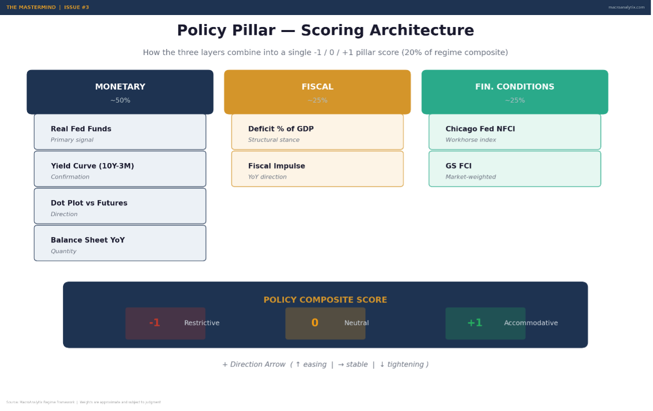
Source: MacroAnalytix Regime Framework | Weights are approximate and subject to judgment
Monetary policy gets roughly half the weight. I look at real Fed Funds (primary signal), the yield curve (confirmation), forward guidance (direction), and the balance sheet (quantity). These combine into a monetary sub-score that ranges from accommodative to restrictive.
Fiscal policy gets roughly a quarter of the weight. I track the deficit level (structural stance) and the fiscal impulse (direction). A widening deficit with rising impulse scores as stimulative. A narrowing deficit with negative impulse scores as contractionary.
Financial conditions get the remaining quarter. NFCI and GS FCI together tell me whether the combined effect of monetary and fiscal policy is actually reaching the economy. Loose conditions confirm the accommodative read. Tight conditions override the headline numbers.
The composite score maps to the same -1/0/+1 framework as the other pillars:
+1 (Accommodative): Real Fed Funds below -1%, OR balance sheet expanding year-over-year, OR financial conditions meaningfully loose. The Fed is actively supporting. Growth tailwind.
0 (Neutral): Real rate around zero, financial conditions near average. Policy is neither helping nor hurting. The economy is on its own.
-1 (Restrictive): Real rate above +1% AND shrinking balance sheet. The Fed is actively restraining. Growth headwind.
As always, the trend matters as much as the level. Policy at 0 and moving toward accommodation is very different from policy at 0 and moving toward restriction. I track both the current score and the direction arrow in every weekly Setup.
Mistakes I’ve Made (So You Don’t Have To)
The policy pillar has its own set of traps. Here are the ones that caught me.
Fighting the Fed.
The oldest cliché in finance for a reason. When the Fed is actively easing, the path of least resistance for risk assets is up. When they’re actively tightening, it’s down. Simple. And yet I’ve repeatedly tried to be clever, shorting into easing cycles because valuations looked stretched, or going long into tightening cycles because growth looked strong.
The Fed moves slower than you think, but it moves more than you think. They don’t stop after one hike or one cut. The cycle continues until conditions force a change. If you fight the direction, you’re fighting the most powerful force in financial markets. I’ve learned to respect it, even when I disagree with the policy.
Watching FOMC Day Instead of the Reaction Function.
FOMC days are exciting. Markets move. Headlines fly. It feels like the most important day of the quarter. And it’s mostly noise.
What matters isn’t what the Fed did today. It’s what the Fed will do in response to the data that hasn’t come out yet. That’s the reaction function, the mapping from economic data to policy response. If you understand the reaction function, you can anticipate the Fed’s moves. If you’re just reacting to FOMC day, you’re trading yesterday’s news.
I spend far more time now thinking about what data would cause the Fed to change course than I do parsing the statement. What level of Core PCE makes them comfortable cutting? What unemployment rate triggers concern? What financial conditions reading makes them nervous? Those are the questions that matter. The statement is just a snapshot of where those answers stood six weeks ago.
Ignoring Fiscal Entirely
I already mentioned this, but it’s worth emphasising as a standalone mistake because I made it for years and it cost me real money.
In 2023, I kept expecting the economy to slow because the Fed was hiking aggressively. Real rates were high. The balance sheet was shrinking. Everything in my monetary toolkit said “restriction.” But the economy kept growing. Consumer spending held up. The labour market refused to crack.
The answer was fiscal. The deficit was running at 6%+ of GDP. The government was pumping money into the economy at a rate that partially offset everything the Fed was doing. If I’d been tracking fiscal impulse, I’d have seen the offset and adjusted my expectations. Instead, I kept waiting for the slowdown that didn’t come.
Now fiscal is a permanent part of the framework. Not as a forecasting tool—I don’t try to predict what Congress will do—but as a measurement of what’s actually happening. The deficit doesn’t lie.
Confusing Nominal and Real
I covered this in the real rates section, but it bears repeating as a mistake. I’ve watched otherwise smart analysts call policy “tight” during periods when real rates were negative, or “loose” when real rates were actually restrictive. The nominal rate is meaningless without the inflation context.
The fix is simple: always think in real terms. Always. When someone says “rates are at 5%,” your first thought should be “what’s inflation?” If inflation is 3%, real rates are +2%—that’s tight. If inflation is 6%, real rates are -1%—that’s loose. The absolute level of rates tells you nothing about the stance of policy.
Overreacting to Fed Language
The Fed communicates in code. “Patient” means something. “Flexible” means something different. “Data dependent” is the ultimate hedge. The cottage industry of Fed statement parsing is a real thing, and I got sucked into it for years.
Here’s what I’ve learned: the words matter less than the numbers. Real rates, the balance sheet, financial conditions, these are the data. The statement is the narrative the Fed wraps around the data. When the narrative and the data agree, fine. When they disagree, trust the data.
Powell can talk about being hawkish all day long. If real rates are falling and financial conditions are loosening, policy is accommodative regardless of what he says. The markets know this, which is why the reaction to statements is often counterintuitive. Don’t parse words. Track numbers.
From Policy Reading to Actual Positions
Here’s roughly how the policy pillar translates into cross-asset positioning:
When policy is accommodative (+1): Duration is less attractive because rates are low and likely to rise eventually. Risk assets benefit from cheap money and easy credit. Equities and credit outperform. The dollar tends to weaken as real rates fall. Commodities benefit from the demand support. Curve steepens as the front end stays anchored and the back end reprices for growth and inflation. This is the environment where you lean into risk, but watch for the Policy Mix Matrix. If fiscal is also loose, you’re in bubble risk territory.
When policy is neutral (0): The most ambiguous environment. Policy isn’t helping or hurting. Asset returns depend more on the Growth and Inflation readings. Position based on the fundamental regime, not the policy modifier. Maintain balanced positioning and don’t overweight any directional bet based on the policy stance alone.
When policy is restrictive (-1): Duration becomes increasingly attractive as the market prices in eventual easing. Risk assets face headwinds from tighter credit and higher borrowing costs. Quality over speculative beta. Cash becomes competitive, you’re getting paid to wait. Credit spreads tend to widen. The curve flattens or inverts as the front end gets pulled up by the Fed while the back end falls on growth fears. This is the environment for patience and defensiveness.
But always, always, overlay the Policy Mix Matrix. Restrictive monetary plus loose fiscal is a very different trade from restrictive monetary plus restrictive fiscal. The matrix tells you which combination you’re actually dealing with, and the cross-asset implications are distinct for each quadrant.
Building Your Own Policy Framework
Same principle as the previous two pillars. The architecture matters more than the exact indicators. Here’s how I’d build it from scratch:
Start with the three layers. Separate monetary, fiscal, and financial conditions. This is the structure that prevents you from overweighting any single policy dimension and ensures you capture the interactions.
For monetary policy, choose indicators that reflect the actual stance, not just the headline. You need something that measures the real rate (nominal rate minus inflation). You need a curve spread that captures the market’s forward view. You need a measure of balance sheet direction. And you should track market expectations versus Fed guidance to spot the tension that drives rates vol.
For fiscal policy, track the deficit level and the impulse. The level is easy, CBO publishes it regularly, and Treasury monthly statements give you near-real-time data. The impulse requires a simple year-over-year calculation that tells you whether fiscal is becoming more or less stimulative.
For financial conditions, pick at least one broad index. NFCI is my primary. Some people prefer the GS FCI or Bloomberg’s index. The specific choice matters less than consistently tracking the same measure over time so you develop intuition for what “tight” and “loose” actually look like in real-time.
Build the Policy Mix Matrix. Plot monetary versus fiscal on a 2×2. Update it weekly. It takes thirty seconds and is genuinely the most underrated tool in the entire framework.
Set your thresholds. What real rate level constitutes “restrictive” versus “accommodative”? What deficit level is stimulative? What NFCI reading counts as loose? Write them down before you need them. Same lesson as Growth and Inflation—explicit thresholds prevent you from moving the goalposts when the data is inconvenient.
Connect to the regime matrix. Policy alone doesn’t tell you the playbook. It’s a modifier that shapes how the Growth × Inflation picture expresses across assets. The same Growth/Inflation regime with accommodative policy is a completely different animal from the same regime with restrictive policy. That interaction is where the framework generates its best signals.
The Bottom Line
Policy is the bridge between the economy and markets. Growth and Inflation tell you what’s happening. Policy tells you what the authorities are doing about it and whether that help or hindrance is reinforcing the current regime or setting up the next transition.
The three-layer model, monetary, fiscal, financial conditions, gives you a complete picture. Real rates matter more than nominal rates. The yield curve confirms but doesn’t lead. Fiscal impulse is the most underrated variable in macro. Financial conditions capture the net effect of everything. And the Policy Mix Matrix tells you whether the two biggest forces in the economy are working together or against each other.
Right now, my Policy reading is 0 (Neutral), trend flat. The Fed is on hold, watching the data. Real rates are modestly positive. Fiscal remains stimulative through deficit spending, but the impulse has stabilised rather than accelerated. Financial conditions are loose. The Policy Mix Matrix flags both levers as accommodative, bubble risk territory in the classification, worth monitoring but not yet actionable.
Next time, we’ll cover Liquidity, the fourth pillar. The plumbing of the financial system. Central bank balance sheets, reserve dynamics, funding market stress and the indicators that tell you whether the system has enough grease to keep running. If Policy is what the authorities intend, Liquidity is what actually flows through the pipes. That distinction matters more than most people realise.
Until then, start building your own policy framework. What would you track for real rates? How would you measure fiscal impulse? Which financial conditions index would you choose? Map out the Policy Mix Matrix for the last five years and see which quadrant produced which market outcomes. The exercise is worth it.
Questions or feedback? macroanalytix.research@gmail.com
Disclaimer: All content published by MacroAnalytix is for research and educational purposes only. Nothing on this site or in our publications should be interpreted as financial advice, investment recommendations, or a solicitation to buy or sell securities. You are solely responsible for your own financial decisions. Please conduct your own due diligence and consult with a licensed financial professional before making any investment decisions.