

Welcome to The Masterclass
I’ve been thinking about how to do this series for a while.
The Setup gives you my weekly regime call. The Breakdown goes deep on themes. The Pulse catches stuff that can’t wait until Sunday. But none of that explains how I actually think about this stuff. the mental models, the frameworks, the hard-won lessons from getting it wrong more times than I’d like to admit.
That’s what The Mastermind is for. Less “here’s the answer,” more “here’s how I think about the question.”
I’m not going to hand you a recipe. Partly because the specific indicators I use aren’t magic, they’re just the ones I’ve found work for me. Partly because if you just copy someone else’s framework without understanding why it works, you’ll abandon it the first time it gives you a signal you don’t like. And partly because, honestly, I think you’ll build something better if you understand the principles and adapt them to your own style.
We’re starting with Growth. It’s the pillar I weight most heavily, and it took me the longest to get right. Let me tell you why.
Why I Obsess Over Growth
Here’s something that took me years to internalize: most of what matters in macro comes down to two questions. Is growth going up or down? Is inflation going up or down? That’s it. Everything else; policy, liquidity, sentiment, is just context for how those two forces play out.
I used to make this way more complicated than it needed to be. I’d track dozens of indicators, build elaborate models, convince myself that some obscure data series held the key to everything. And you know what? Most of it was noise.
The reason is pretty intuitive once you stop and think about it. Corporate earnings are basically a derivative of economic growth. When the economy expands, companies sell more stuff, margins improve, earnings grow. When the economy contracts, the whole thing reverses. And since asset prices ultimately reflect earnings - present and expected - growth is what drives returns.
Same logic works across asset classes. Credit spreads? They’re pricing default risk, which is a function of whether companies can generate enough cash to service their debt. Rates? Growth expectations drive term premium and curve shape. FX? Capital flows to where growth is. Commodities? Demand growth drives prices. It all comes back to the same thing.
I’m not saying you can ignore everything else. But if you get growth right, you’re playing with the wind at your back. Get it wrong, and no amount of cleverness in the other pillars will save you.
The Third Question Nobody Talks About
Okay, so growth up or down, inflation up or down. That’s the fundamental picture. But here’s the thing that separates okay macro analysis from actually making money: you also need to know who’s positioned wrong.
Because markets don’t just move on fundamentals. They move on the unwind of wrong-footed positions. The violence of a move - how fast, how far, how much it overshoots, depends almost entirely on who’s offside and has to capitulate.
Think about it this way. If growth is about to roll over and everyone already expects it - they’re positioned defensively, hedges are in place, cash is high, then when the data confirms, the move might be a yawn. The bad news was priced. But if growth is about to roll over and everyone’s levered long, chasing the last bit of upside, convinced the expansion has years to run? That’s when you get the face-ripping moves. The forced selling. The “how did it drop this much on that data?” moments.
I’ve learned to always ask: who gets fucked if I’m right?
If growth surprises to the upside, who’s short and will be forced to cover? If it surprises to the downside, who’s levered long and will need to liquidate? The answer tells you not just direction but magnitude. It tells you whether you’re trading with the forced flows or against them.
This is why consensus matters, not because the consensus is usually wrong, but because when it is wrong, the move is amplified by everyone scrambling for the same exit. The pain trade isn’t just about being right. It’s about being right when being wrong would hurt the most people.
Some practical things I look at: fund positioning surveys, futures commitment of traders data, ETF flows, option skew. None of these are perfect, but together they paint a picture of where the crowding is. When my fundamental view aligns with a crowded position on the other side, that’s when I get more aggressive. When my view would require fighting entrenched positioning, I stay smaller and more patient.
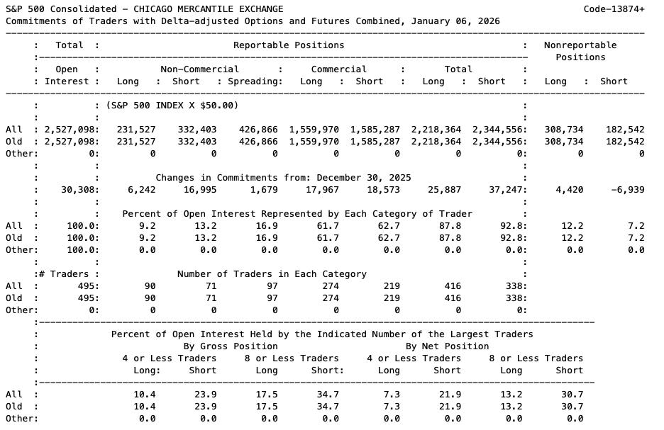
S&P500 Commitment of Traders Report Jan 6, 2026. https://www.cftc.gov/dea/options/deacmelof.htm
The regime framework gives you the fundamental read. But the money is made and lost in understanding who’s positioned for a different outcome.
The Distinction That Changed Everything
Okay, here’s the thing nobody told me when I started: not all growth data is created equal. There’s a fundamental difference between indicators that tell you where growth is going and indicators that tell you where growth is now. Mixing them up will cost you money. I know because it cost me money.
Leading indicators are forward-looking. They reflect decisions being made today that will show up in economic activity months from now. Orders placed, permits filed, credit extended. These are commitments - bets on the future that become reality with a lag.
Coincident indicators tell you what’s happening right now. Employment, production, income, spending. These confirm the current state of the economy, not where it’s headed.
The mistake I used to make and I see this constantly, is treating these as interchangeable. You see a strong jobs report and think “economy’s great!” But employment is actually a lagging indicator. It often peaks after the economy has already turned. By the time the labor market cracks, you’re already deep into the downturn.
Or you see a weak survey and panic. But surveys can give false signals for months. They measure what people say they’re experiencing, not what they’re actually doing. Sometimes sentiment gets ahead of reality, or behind it.
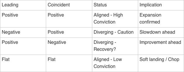
The solution is to track both categories separately and watch for agreement or divergence. When leading and coincident indicators tell the same story, you can act with conviction. When they disagree, something’s about to change. The leading indicators are usually right about direction; the coincident data helps you calibrate timing.
What Actually Makes a Good Leading Indicator
I’ve wasted a lot of time on indicators that looked good on paper but didn’t actually work. Here’s what I’ve learned to look for:
It has to reflect real commitments, not just intentions. This is huge. Survey data asking firms about their “expectations” is way less reliable than data showing what they’ve actually ordered or contracted for. Talk is cheap. Money on the table is signal. When someone places an order or files a permit, they’re making a commitment that will turn into economic activity. When they tell a poll they’re “optimistic,” that could mean anything.
You need to be able to explain why it leads. If you can’t articulate the transmission mechanism, be suspicious. New orders lead production because firms produce to fill orders, that’s a clear chain. But some indicators have correlations that don’t make logical sense. Those tend to break down exactly when you need them most.
It should have worked across multiple cycles. Anyone can find an indicator that “predicted” the last recession if they torture the data enough. What you want is something with a track record across different environments. And even then, every indicator has given false signals at some point. The goal isn’t perfection, it’s a useful edge.
Take the Conference Board’s Leading Economic Index as an example. It’s one of the most-watched composites, with a track record going back decades. But look at how it’s actually performed:
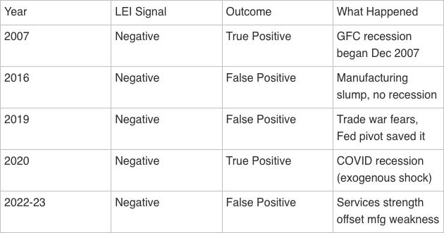
Three false positives in the last decade alone. That’s not a knock on the LEI, it’s a reminder that no indicator is infallible. The 2016 and 2019 episodes both featured manufacturing weakness that didn’t spread to the broader economy. The 2022-23 signal was the longest false positive on record, confounded by post-COVID services strength. These patterns repeat which is why diversifying across indicator types matters more than finding the “perfect” single measure.
It needs to be timely enough to act on. An indicator that comes out quarterly with a two-month lag isn’t much use for real-time positioning. Monthly data with a short reporting delay is the sweet spot for most purposes.
The specific indicators you choose matter less than whether they meet these criteria. I’ve seen good frameworks built on completely different data. The principle is what matters.
And Coincident Indicators?
Coincident indicators serve a different purpose. They’re not for prediction, they’re for confirmation. You want to know whether the economy is actually doing what the leading indicators suggested it would do.
A few things I look for:
Measure actual activity, not proxies. GDP is the ultimate coincident indicator, but it comes out quarterly with big lags. You want higher-frequency data that moves closely with GDP - actual production volumes, actual employment, actual spending.
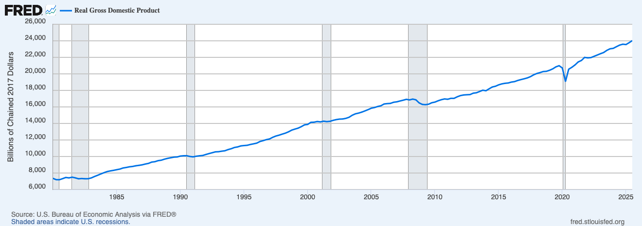
Source: https://fred.stlouisfed.org/series/GDPC1#
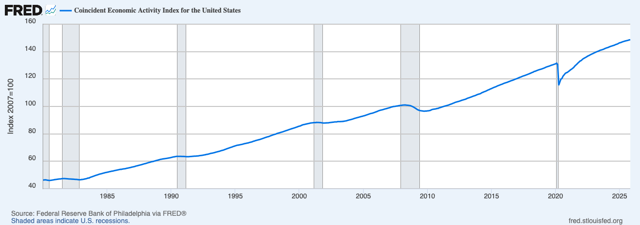
Source: https://fred.stlouisfed.org/series/USPHCI#
Cover a meaningful share of the economy. This is where a lot of people go wrong. Manufacturing data gets tons of attention but manufacturing is only about 11% of the US economy. Services are closer to 70%. If you’re over-weighting manufacturing, you’re getting a skewed picture. I’ve seen people get bearish because manufacturing was contracting while the overall economy was fine because services held up.
Source: https://www.bea.gov/data/gdp/gdp-industry
Hard to manipulate or distort. The more an indicator relies on actual counts of real things; units produced, people employed, dollars spent, the more I trust it. Some data series have seasonal adjustment quirks or model-based estimates that can introduce noise. The simpler and more direct, the better.
When coincident data confirms what the leading indicators suggested, I act with more conviction. When it contradicts, I get cautious and start looking for what I might be missing.
The Divergence Framework
This is probably the most useful thing I can share with you.
The real value of tracking leading and coincident separately isn’t either score in isolation, it’s the relationship between them. When they agree, you have a clear signal. When they diverge, you have an early warning that the current state is about to change.
Let me show you how this worked in real time over the past couple months:
December 2025: My leading indicators had turned negative. Forward-looking surveys were weak, market-based signals were depressed, the composite measures were flashing warnings. But coincident indicators were still positive. Services expanding, jobs being added, consumer spending holding up. Classic divergence pattern: “caution, slowdown ahead.” That’s exactly what drove my Stagflation call in Issue #004. The leading data was telling me something the headlines weren’t.
January 2026: The leading indicators stabilized. Coincident data held positive. Now both categories were aligned, telling the same story: deceleration without collapse. That’s why the regime shifted from Stagflation to Neutral/Chop. The divergence had resolved.
This framework won’t tell you exactly what’s going to happen. Nothing will. But it tells you how much confidence to have in your current read and what to watch for next. Honestly, that’s often more valuable than a point estimate.
Mistakes I’ve Made (So You Don’t Have To)
I’ve made every mistake you can make with growth data. Here are the ones that cost me the most:
Getting Obsessed With One Number
Early in my career, I’d anchor on whatever indicator had worked recently. ISM was my thing for a while. Then I got burned when ISM was weak but the economy kept trucking along because services were fine.
No single indicator tells the whole story. Ever. The economy is too complex. You need multiple measures, ideally ones that capture different aspects of activity. When they agree, great. When they disagree, that’s information too.
Confusing Level With Direction
This one still trips me up sometimes. A reading of 52 on a diffusion index means “expansion.” Good, right? Well, it depends. If it was 48 last month, then 52 is great: things are improving. If it was 56 last month, then 52 is concerning, things are deteriorating, even though the level is still positive.
Direction often matters more than level, especially at turning points. I try to track both now, but it took me too long to learn this.
Fighting The Trend
This is the one that’s cost me the most money. Growth indicators have momentum. When things are weakening, they tend to keep weakening. When things are strengthening, they tend to keep strengthening. Mean reversion happens eventually, but timing it is brutally hard.
I used to see a weak reading and think “okay, it’s got to bounce from here.” Spoiler: it usually didn’t. Now I try to respect the trend until there’s genuine evidence of a turn, usually from the divergence framework, from extreme readings that historically don’t persist, or from policy changes that alter the trajectory.
Ignoring Positioning
I talked about this earlier, but it’s worth repeating as a mistake I made repeatedly: being right on the fundamentals but wrong on timing because I ignored who was positioned the other way.
I’d see growth weakening, get short, and then watch the market grind higher for weeks because everyone else saw the same thing and was already positioned for it. The trade was crowded. There was no one left to sell. It took the data actually confirming signals repeatedly before the move happened.
Now I try to think about not just whether I’m right, but whether being right will actually move prices. If everyone already agrees with me, the move might already be done.
Over-weighting What Gets Attention
Financial media loves a headline. ISM day, factory orders, industrial production. But manufacturing is 11% of GDP. Services are 70%.
The “two-speed economy” thing we’ve been tracking recently - manufacturing in recession while services hold up - isn’t unusual. It’s happened multiple times in the past decade. If you weight by economic significance rather than media attention, you’d have gotten much better reads.
Treating Surveys Like Hard Data
Surveys measure what people say. Hard data measures what they actually do. These diverge more often than you’d expect.
I remember a period where business sentiment surveys were extremely weak, firms were telling polls they were worried about the economy, planning to cut back, etc. But actual spending, hiring and investment data stayed resilient. If you’d traded the surveys, you’d have gotten killed. The hard data was right.
Surveys are still useful, they’re timely and sometimes genuinely predictive. But when surveys say one thing and hard data says another, I’ve learned to trust the hard data until proven otherwise.
From Growth Reading to Actual Positions
Okay, so you’ve got a growth read. Now what? Here’s roughly how I think about it:
When growth is clearly positive: Lean into risk. Equities over bonds, cyclicals over defensives, small over large (usually), tight credit, commodity demand. Corporate earnings are growing, default risk is low, the wind is at your back. Duration is less attractive because yields tend to rise with growth.
When growth is neutral: Welcome to the chop zone. This is honestly the hardest environment because nothing has a clear edge. I focus on quality over speculation, carry strategies if vol stays low, and being more selective about what I own.
When growth is clearly negative: Get defensive. Bonds over equities, defensives over cyclicals, large over small, expect credit to widen. Duration tends to work as yields fall on growth fears. Cash becomes competitive. Default risk is rising, so credit quality matters a lot.
But remember, always overlay the positioning question. If growth is negative but everyone’s already hiding in bonds and defensives, the pain trade might actually be up. If growth is positive but everyone’s already levered long, the risk is a pullback on the slightest disappointment. The fundamental read tells you the direction; the positioning read tells you the path.
Building Your Own Framework
I’m not going to tell you exactly which indicators to use. Partly because I don’t want to give away every detail of my process. But mostly because I think you’ll build something better if you figure it out yourself.
Here’s how I’d approach it:
Start with the structure. The architecture matters more than the contents. Separate leading from coincident indicators. Define what “positive,” “neutral,” and “negative” mean for each bucket. Build a divergence check between the two categories
Choose indicators that make sense to you. Diversify across data types. Leading: forward commitments where you can explain the causal mechanism. Coincident: actual activity across meaningful parts of the economy. Avoid: Over-weighting any single sector.
Add a positioning overlay. Know who’s on what side of the trade. Surveys, COT data, flows, option markets, pick your poison. The fundamental read without positioning context is incomplete.
Set thresholds explicitly. Write them down before you need them. What constitutes expansion vs contraction? What counts as a meaningful change? Clear thresholds prevent moving the goalposts when data is inconvenient.
Backtest but don’t overfit. Simpler is usually better. Your framework should relate to historical outcomes. Twenty perfectly-tuned indicators will probably fail on the next cycle.
Iterate as you go. No framework is perfect out of the box. Track what works and what doesn’t. When wrong, figure out why; when right, ask if it was skill or luck.
The Bottom Line
Growth is the engine of regime classification because it has the strongest and most consistent relationship with cross-asset returns. But knowing the fundamental direction is only half the battle. You also need to know who’s positioned wrong because that determines whether your correct call makes you money or just makes you early.
The methodology; separating leading from coincident, watching for divergences, overlaying positioning, avoiding the mistakes I’ve walked through here matters more than any specific indicator choice.
Right now, my Growth reading is 0 (Neutral), with leading and coincident aligned in a soft landing configuration. That’s better than December’s -1, when the divergence was flashing warnings. But it’s not an all-clear. The leading indicators stabilized rather than improved, and the margin of safety is thin.
Next time, we’ll cover Inflation. The second axis of the regime matrix and the pillar that determines whether you’re in Goldilocks or Stagflation, Reflation or Deflation. I’ll walk through how I think about the inflation pipeline, why different inflation measures diverge, and how to spot pressure building before it shows up in the headlines.
Until then, start thinking about how you’d structure your own growth framework. What would you track as leading? What as coincident? How would you gauge positioning? Sometimes the exercise of thinking it through is more valuable than any specific answer I could give you.
Questions or feedback? macroanalytix.research@gmail.com
Disclaimer
All content published by MacroAnalytix is for research and educational purposes only. Nothing on this site or in our publications should be interpreted as financial advice, investment recommendations, or a solicitation to buy or sell securities. You are solely responsible for your own financial decisions. Please conduct your own due diligence and consult with a licensed financial professional before making any investment decisions.